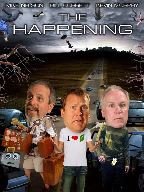
about a Thomas Kinkade movie that sounded like it would be complete garbage. Guess what?
By all accounts, this movie is a celluloid armpit of crap. You can buy it on DVD at Target, which is where I became reminded of its existence. Thomas Kinkade is a hack who signs his name to paintings by lots of random artists, get sued, and gives out memos to studios making horrible demads to make doomed projects even worse than usual. Vanity Fair got a hold of his memo.
The sixteen guidelines for creating the “The Thomas Kinkade Look”.
1) Dodge corners or create darkening towards edge of image for “cozy” look. This may only apply to still imagery, but is useful where applicable.
2) Color key each scene to create mood, and color variation. When possible, utilize cooler tones to suggest somber moods, and warmer, more vibrant tones to suggest festive atmosphere. In general, create a color scheme for each scene that can be accentuated through filtering, DI treatments, or through lighting. Most of my paintings feature an overall cool color envelope, into which warm accents are applied.
3) Create classic compositions. Paintings generally utilize a theme and variation compositional motif. Heavy weighting of the image towards one side, with accented areas of interest balancing it on the other side. Allow the eye to wander into the scene through some entry point. Be aware of where the viewer is standing at all times. Utilize traditional eye levels for setting the shot — that is, no high vantage points, off-kilter vantage points, or “worms eye view” vantage points. Generally focus on a standing adults viewpoint of the scene at hand.
4) Awareness of edges. Create an overall sense of soft edges, strive for a “Barry Lyndon” look. Star filters used sparingly, but an overall “gauzy” look preferable to hard edge realism.
5) Overall concept of light. Each scene should feature dramatic sources of soft light. Dappled light patches are always a positive, glowing windows, lightposts, and other romantic lighting touches will accentuate the overall effect of the theme of light.
6) Hidden details whenever possible, References to my children (from youngest to oldest as follows): Evie, Winsor, Chandler and Merritt. References to my anniversary date, the number 52, the number 82, and the number 5282 (for fun, notice how many times this appears in my major published works). Hidden N’s throughout — preferably thirty N’s, commemorating one N for each year since the events happened.
7) Overall sense of stillness. Emphasize gentle camera moves, slow dissolves, and still camera shots. A sense of gradual pacing. Even quick cut-away shots can slightly dissolve.
8) Atmospheric effects. Whenever possible utilize sunset, sunrise, rainy days, mistiness — any transitory effect of nature that bespeaks luminous coloration or a sense of softness.
9) A sense of space. My paintings feature both intimate spaces and dramatic deep space effects. We should strive for intimate scenes to be balanced by deeper establishing shots. (I know this particular one is self-evident, but I am reminded of it as I see the pacing of the depth of field in Kubrick’s “Barry Lyndon”.)
10) Short focal length. In general, I love a focal plane that favors the center of interest, and allows mid-distance and distant areas to remain blurry. Recommend “stopping down” to shorten focal lengths.
11) Hidden spaces. My paintings always feature trails that dissolve into mysterious areas, patches of light that lead the eye around corners, pathways, open gates, etc. The more we can feature these devices to lead the eye into mysterious spaces, the better.
12) Surprise details. Suggest a few “inside references” that are unique to this production. Small details that I can mention in interviews that stimulate second or third viewings — for example, a “teddy bear mascot” for the movie that appears occasionally in shots. This is a fun process to pursue, and most movies I’m aware of normally have hidden “inside references”. In the realm of fine art we refer to this as “second reading, third reading, etc.” A still image attracts the viewer with an overall impact, then reveals smaller details upon further study.
13) Mood is supreme. Every decision made as to the visual look of each shot should include the concept of mood. Music can accentuate this, use of edges can accentuate this, atmospheric effects accentuate this, etc.
14) The concept of beauty. I get rid of the “ugly parts” in my paintings. It would be nice to utilize this concept as much as possible. Favor shots that feature older buildings, ramshackle, careworn structures and vehicles, and a general sense of homespun simplicity and reliance on beautiful settings.
15) Nostalgia. My paintings routinely blend timeframes. This is not only okay, but tends to create a more timeless look. Vintage cars (30’s, 40’s, 50’s, 60’s etc) can be featured along with 70’s era cars. Older buildings are favorable. Avoid anything that looks contemporary — shopping centers, contemporary storefronts, etc. Also, I prefer to avoid anything that is shiny. Our vintage vehicles, though often times are cherished by their owners and kept spic-n-span should be “dirtied up” a bit for the shoot. Placerville was and is a somewhat shabby place, and most vehicles, people, etc bear traces of dust, sawdust, and the remnants of country living. There are many dirt roads, muddy lanes, etc., and in general the place has a tumbled down, well-worn look.
16) Most important concept of all — THE CONCEPT OF LOVE. Perhaps we could make large posters that simply say “Love this movie” and post them about. I pour a lot of love into each painting, and sense that our crew has a genuine affection for this project. This starts with Michael Campus as a Director who feels great love towards this project, and should filter down through the ranks. Remember: “Every scene is the best scene.”
The list above is not all-inclusive, but is a good starting point for internal dialogue. These guidelines are not listed in order of importance, but are dictated off the top of my head. After painting for nearly 40 years, I still wake up every morning daydreaming about new ways to make paintings. Creating a movie is a natural extension of the picture making process, and hopefully my catalog of visual paintings, along with my visual guidelines in this memo will provoke dialogue, experimentation, and a sense of over-arching visual purpose.

![]() Sinematurk Link
Sinematurk Link


